
Designing on the wrist.
Designing on the wrist.

Date. 2015.
Company. Tuenti.
Role. Product Designer.
Services. UX/UI, Prototyping, Information Architecture.
Tools. Sketch, Apple Watch SDK, Zeplin, Jira, Pruebas en dispositivos reales.
Situation — A Top-Level Opportunity.
Situation — A Top-Level Opportunity.
2015. Apple is about to launch its first Apple Watch in Spain. At launch, only a few apps will be available, and Apple reaches out to several companies to ensure they have a presence from day one. Among them, Tuenti Móvil. The premise is clear: if we want to be in the App Store on launch day, we need to move fast. Very fast.
2015. Apple is about to launch its first Apple Watch in Spain. At launch, only a few apps will be available, and Apple reaches out to several companies to ensure they have a presence from day one. Among them, Tuenti Móvil. The premise is clear: if we want to be in the App Store on launch day, we need to move fast. Very fast.
The challenge: Design and develop an app for a device we had never used, with a radically different interface, in an absurdly short time.
The challenge: Design and develop an app for a device we had never used, with a radically different interface, in an absurdly short time.
The deadline: Two days.
The deadline: Two days.
The team: One iOS developer and me.
The team: One iOS developer and me.
The mission: Create a functional, intuitive app that seamlessly integrates with the watch’s ecosystem.
The mission: Create a functional, intuitive app that seamlessly integrates with the watch’s ecosystem.
Task — Designing a Relevant Experience in Record Time.
Task — Designing a Relevant Experience in Record Time.
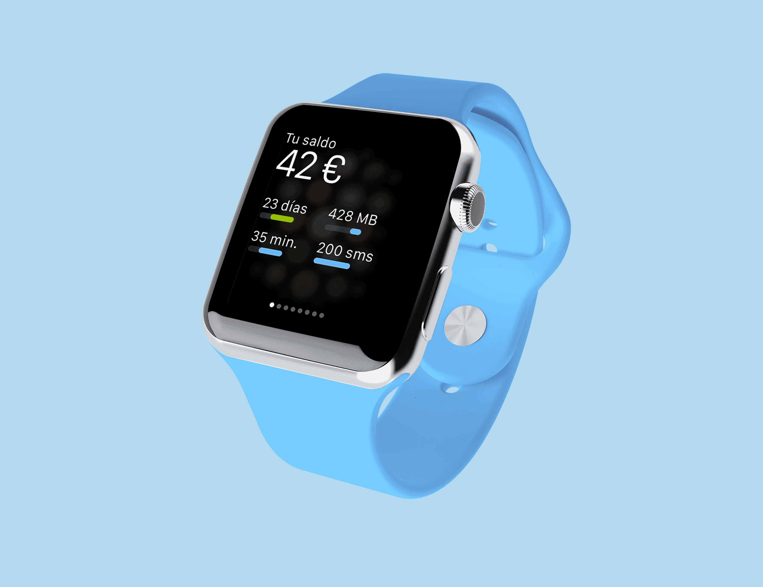
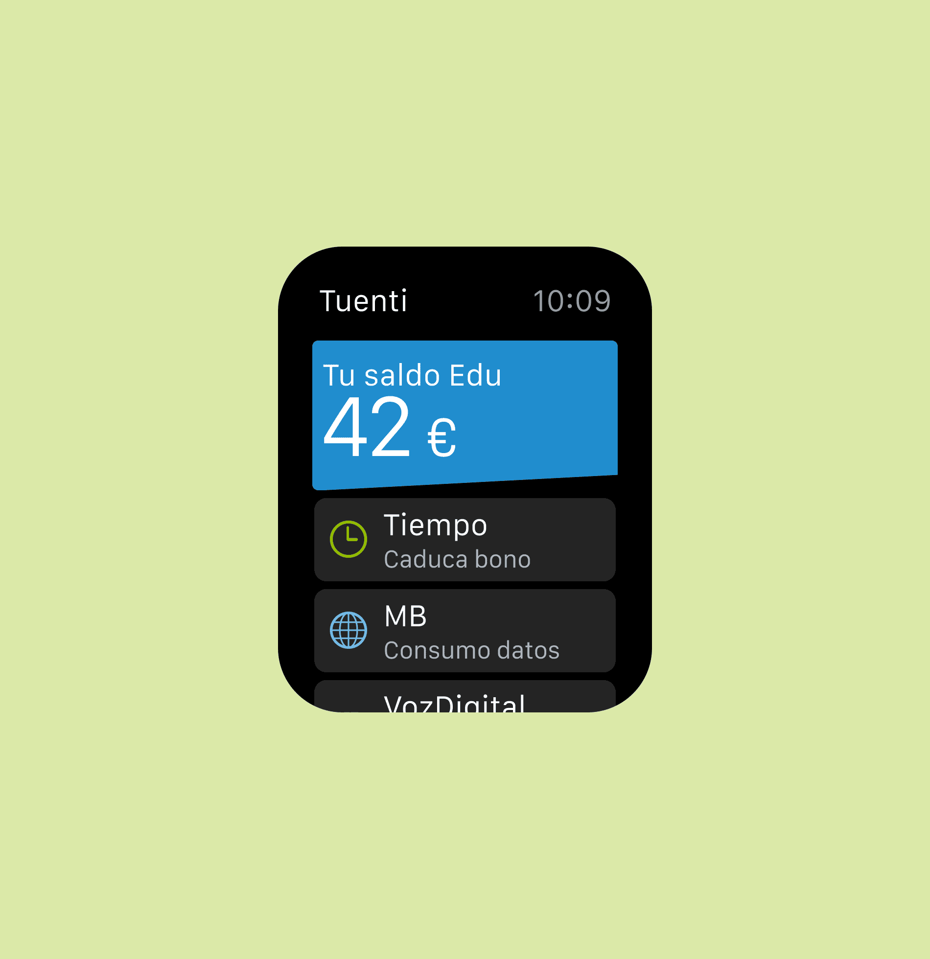
With minimal screen space and a user experience completely different from a smartphone, we had to determine what information from Tuenti Móvil was truly useful on a user’s wrist. We couldn’t simply transfer the mobile app as it was. We had to rethink it from scratch.
With minimal screen space and a user experience completely different from a smartphone, we had to determine what information from Tuenti Móvil was truly useful on a user’s wrist. We couldn’t simply transfer the mobile app as it was. We had to rethink it from scratch.
We focused on the essentials:
We focused on the essentials:
Available balance.
Remaining time on data/voice plans.
Data consumption.
Digital voice minutes used.
SMS consumption.
Call and message notifications.
The ability to reply to messages and answer calls.
No endless menus, no unnecessary elements—just what the user truly needed to see with a flick of the wrist.
No endless menus, no unnecessary elements—just what the user truly needed to see with a flick of the wrist.
Action — 48 Hours of Intense Work at Apple.2
Action — 48 Hours of Intense Work at Apple.2
We locked ourselves in Apple’s offices at Puerta del Sol, Madrid, for two days. It was design and real-time testing—literally.
We locked ourselves in Apple’s offices at Puerta del Sol, Madrid, for two days. It was design and real-time testing—literally.
For the first time in my life, I could design something and instantly see it on an actual Apple Watch, fine-tuning every detail on the spot. The distance at which people check their watches, screen reflections, quick wrist gestures—everything mattered.
For the first time in my life, I could design something and instantly see it on an actual Apple Watch, fine-tuning every detail on the spot. The distance at which people check their watches, screen reflections, quick wrist gestures—everything mattered.
The testing was eye-opening: what looked perfect in a mockup could be unreadable or frustrating to use on the actual watch. Typography, contrast, interaction timing—every tiny detail had to be optimized.
It was also my first hands-on experience with the device. I tested both the 38mm and 42mm models, each with different straps. It wasn’t just about designing for a screen—it was about designing for real ergonomics.
It was also my first hands-on experience with the device. I tested both the 38mm and 42mm models, each with different straps. It wasn’t just about designing for a screen—it was about designing for real ergonomics.
Result — Ready for Launch.
Result — Ready for Launch.
After 48 hours, we had a fully functional, optimized app, ready to be published in the App Store on the same day the Apple Watch launched in Spain.
After 48 hours, we had a fully functional, optimized app, ready to be published in the App Store on the same day the Apple Watch launched in Spain.
Tuenti Móvil was among the first companies with a presence in the Apple Watch App Store, proving our ability to innovate and respond quickly to new technological challenges.
Tuenti Móvil was among the first companies with a presence in the Apple Watch App Store, proving our ability to innovate and respond quickly to new technological challenges.
This project was one of the most intense and rewarding experiences of my career. Designing directly on a new device, in such a constrained environment, in real time, forced me to completely rethink my approach to interface design.
This project was one of the most intense and rewarding experiences of my career. Designing directly on a new device, in such a constrained environment, in real time, forced me to completely rethink my approach to interface design.


Final Reflections.
Final Reflections.
Designing in context changes everything. Seeing a design on a computer screen is not the same as experiencing it on the actual device. Every interaction shifts when the user engages with it in their real environment.
Designing in context changes everything. Seeing a design on a computer screen is not the same as experiencing it on the actual device. Every interaction shifts when the user engages with it in their real environment.
Limitations can be a catalyst. Limited space, limited time, and a small team forced us to simplify and focus on the essentials.
Limitations can be a catalyst. Limited space, limited time, and a small team forced us to simplify and focus on the essentials.
The best test is real-world use. Looking at a prototype in Figma is not the same as flicking your wrist and seeing if you can actually read the information in a second.
The best test is real-world use. Looking at a prototype in Figma is not the same as flicking your wrist and seeing if you can actually read the information in a second.
© 2025 Juanma Jiménez | Designed in Figma & developed in Framer.
13:30
© 2025 Juanma Jiménez | Designed in Figma & developed in Framer.
13:30
© 2025 Juanma Jiménez | Designed in Figma & developed in Framer.
13:30
© 2025 Juanma Jiménez | Designed in Figma & developed in Framer.
13:30